What made you want to become a book designer?
MJ: Like a lot of us, I
stumbled into publishing. My first exposure was with the University of Illinois
Press, where I worked while still a student, mostly making line corrections for
reprints. After two failed attempts at design positions after graduation, I reached
for the Chicago Creative Directory and started cold calling—first on the list
was Joseph Alderfer, the design manager at the University of Chicago Press. I
wasn’t new to cold calling but was startled when Joe said, “Yes, we have an
entry-level position; when can you come by for an interview?” My early years at
Chicago, as well as a later stint in the ’90s, still hold a special place in my
heart because it’s where I learned book design from some very talented people
and fell in love with typography.
Tell us about your home press, Northwestern University
Press?
MJ: From its inception, Northwestern University Press has been at the
forefront in publishing important works of scholarship as well as quality works
of fiction, drama, nonfiction, and poetry. NUP currently
publishes about 60 books a
year.
How many covers do you design in a year?
MJ: About 35% of our covers are in series, which means they’re templated and
need only new imagery, so I’m designing roughly 40 covers a year.
What’s your design process?
MJ: I try to come to a simple understanding of the book, the essence of what
is being discussed. I glean this information from a variety of sources: information
from the acquisitions editor, readers’ reports, the manuscript, and previous
blurbs if the book is a reprint. At times I am in contact with the author about
the cover, but most times acquisitions gives me feedback from the author. I
then start searching out potential visuals and/or check into the rights for
suggested imagery. Occasionally “type only” covers prove best. I meet with
sales & marketing, acquisitions, and the director every two weeks to review
ongoing cover work. If there is a difference of opinion, we often poll our
sales reps, who give valuable feedback on what they predict will do best in the
marketplace.
How is working on a trade cover different than working
on a scholarly cover?
MJ: I feel there is more
freedom in working on trade covers, because more can be left to interpretation.
A novel or book of poetry can elicit a variety of visual images. I take note of
any directives from sales & marketing and also from the authors, although
I’m always careful not to promise that we’ll definitely use their “talented
nephew’s drawing,” just in case. I try to garner most images from royalty-free
stock houses to keep costs down, but sometimes a rights-managed image is the
only way to go. While attending a cover design workshop, a trade publishing
creative director asked “What does the story look like?” I’ve tried to keep
this in mind when working on trade covers.
A
recent trade novel is about a gynecologist contending with Stalin’s prohibition
of abortions in 1936. In the tradition of Russia’s great family novels, the
story encompasses the history of two families. Their lives raise profound
questions about family heritage and genetics, nurture and nature, and life and
death. Not an easy subject to visualize, but we decided on this:

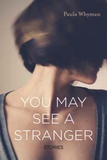
A totally different kind of book, this next novel’s narrator “couldn’t
stop turning and looking at the ‘bad boy’”:
In working on scholarly covers, I’ve found that one option is to
visualize literally what the book is about—the subject matter, the mood, the
timing—all to help to reflect its content.

Another option with
scholarly titles that don’t lend themselves easily to being communicated
visually is to use nondescriptive art:

Crossover
books present a different sort of issue–a cover design that looks less scholarly than the content actually is. Acquisitions has rejected covers because of this. Here is one
that made it through:

What about interiors?
MJ:
With a lot of interior templates in place, I miss the opportunity
to customize interiors. Occasionally a book like Harold or Chicago
and Its Botanic Garden comes along, and I can expand the cover concept to
the interior.


What
are some of your favorite covers that you’ve worked on at Northwestern University Press?
MJ: Millennium Park Chicago, by Cheryl Kent

My Sax Life, by Paquito D’Rivera

Red Army Red, by Jehanne Dubrow

This post is part of the 2015 university press week blog tour. To read more about university press design, check out Princeton University Press, MIT Press, University Press of Kansas, Georgetown University Press, Syracuse University Press, Stanford University Press, Harvard University Press, Athabasca University Press, and Yale University Press.
 New Hires at Northwestern University Press